Bitcoin Drops Into 'BTC Is Dead' Zone on Rainbow Chart
Bitcoin has fallen below a key support band on the popular Rainbow Chart, entering territory historically associated with extreme undervaluation.
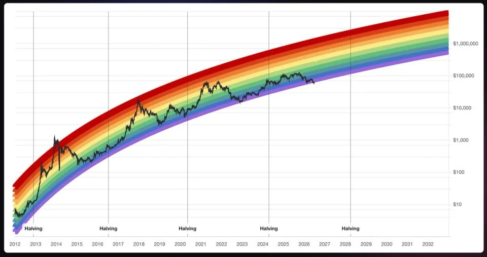
If you've spent any time in crypto circles, you've probably seen the Bitcoin Rainbow Chart — that colorful, logarithmic price map that tells you whether BTC is screaming cheap or dangerously overheated. Well, Bitcoin just crashed through the floor of it, sliding into what the chart bluntly labels the 'BTC is dead' zone. Not exactly a confidence booster for your portfolio.
The Rainbow Chart is a long-running community tool that overlays color-coded bands on Bitcoin's historical price curve. Each band carries a sentiment label, from 'Fire Sale' at the bottom to 'Maximum Bubble Territory' at the top. Breaking below the lowest band is exceedingly rare and, historically speaking, has tended to mark periods of peak pessimism — which contrarian investors sometimes read as a buying signal rather than a reason to panic-sell.
Read more Why 'Buy the Dip' May Be Wall Street's Riskiest Consensus →
Of course, a chart with color bands and catchy labels isn't a financial crystal ball. The Rainbow Chart is a fun heuristic, not a rigorous analytical model. Still, moments like this tend to grab attention because they reflect just how far sentiment has swung. When even a meme-adjacent chart is flashing 'dead,' it's a sign the market mood has gotten genuinely grim.
Whether this represents a generational buying opportunity or just the beginning of further pain is the question every Bitcoin holder is wrestling with right now. History suggests that extreme readings on tools like the Rainbow Chart have occasionally preceded strong recoveries — but timing those rebounds is notoriously difficult, and past performance in crypto is about as reliable as a weather forecast three weeks out.
Continue reading at CoinDesk